The substance sits behind a day rate
A readiness assessment, an ROI model, a phased roadmap and an architecture sketch are not exotic work. They simply do not arrive unbundled from a consulting engagement.
The substance an SME needs to plan an AI programme — a readiness view, an ROI model, a phased roadmap, an architecture sketch, and a reliable picture of what the frontier labs actually shipped this fortnight — normally arrives bundled with a consulting day rate. This platform unbundles it. It does not replace a consultant. It gets a leadership team to the point where that conversation is worth having: a costed hypothesis instead of a blank page.
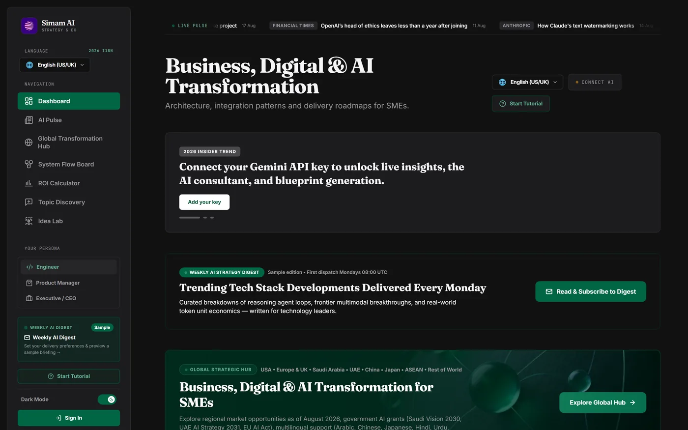
Every frame below is a real screenshot of the running platform, captured through a browser on 18 August 2026. Nothing here is a mockup.
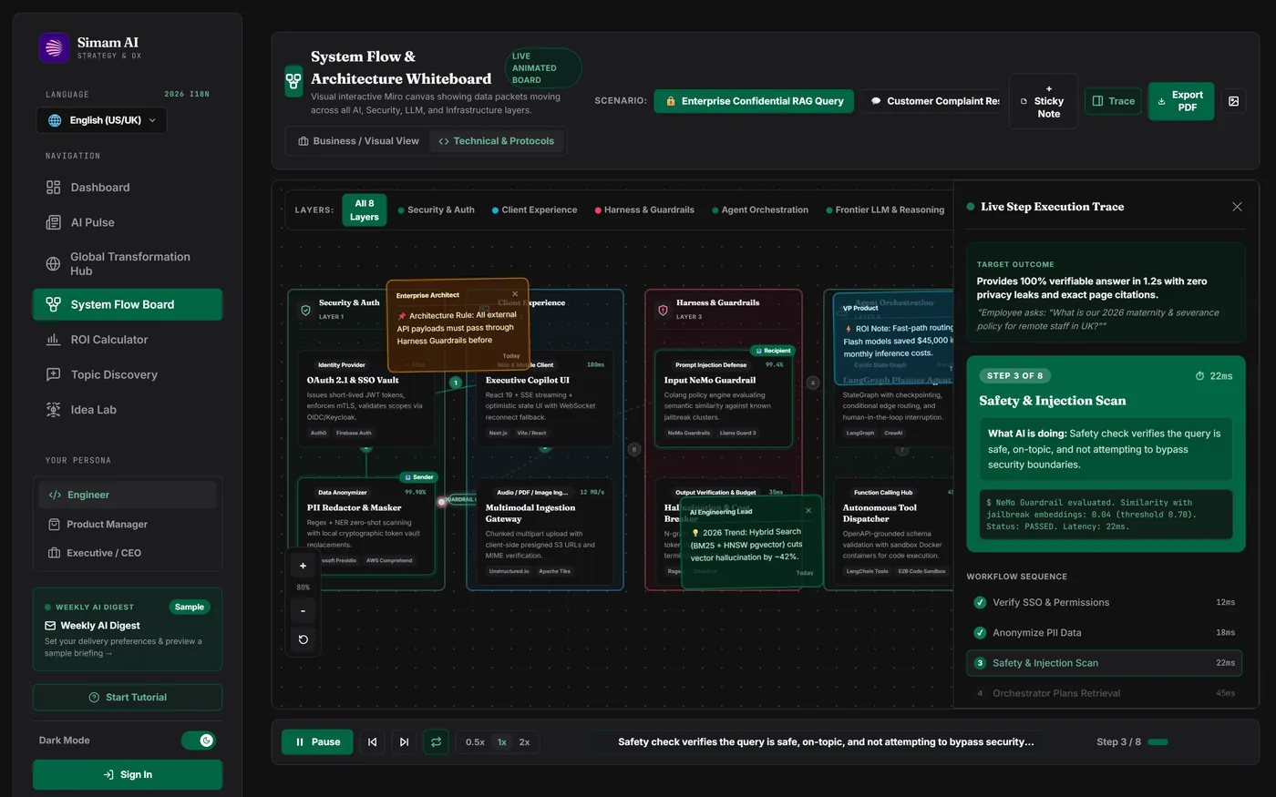
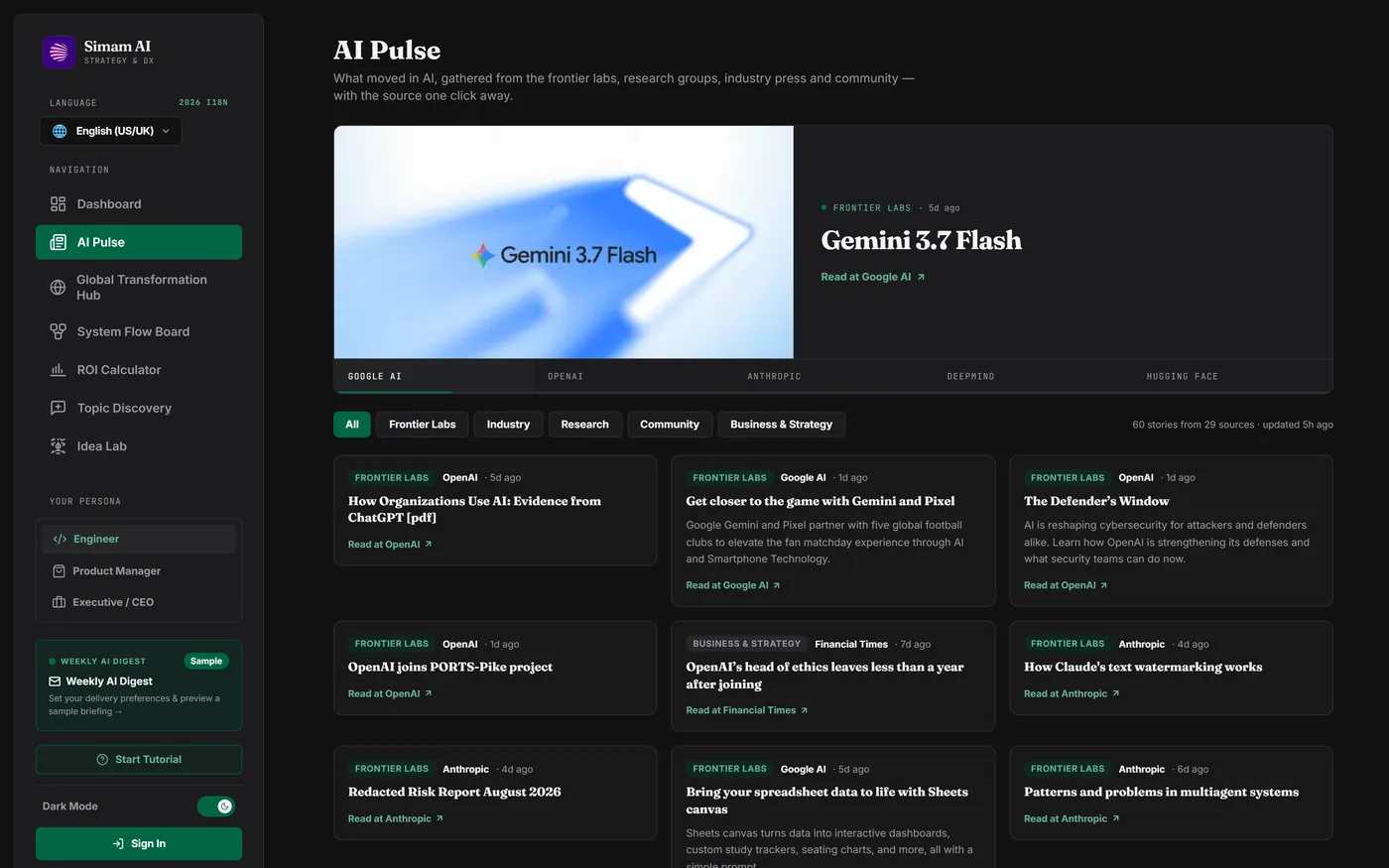
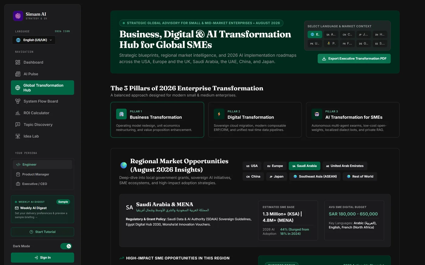
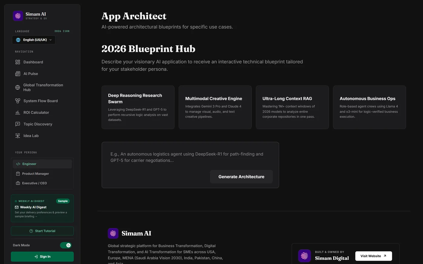
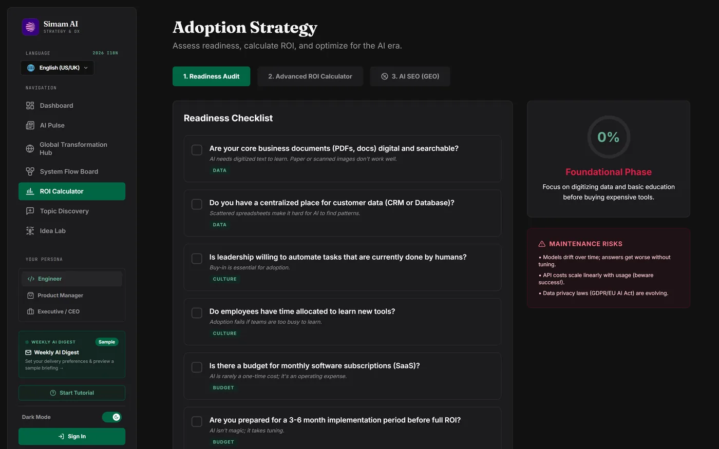
What this proves: a strategy platform can hold eleven distinct tools, three personas and ten languages without fragmenting into eleven unrelated screens — provided the persona, the market context and the design language are decided once and then inherited everywhere.
SMEs and mid-market teams planning a transformation programme hit the same wall: the substance they need sits inside engagements they cannot justify.
A readiness assessment, an ROI model, a phased roadmap and an architecture sketch are not exotic work. They simply do not arrive unbundled from a consulting engagement.
The product does not try to replace a consultant. It gets a leadership team to a costed hypothesis, which is the point at which talking to one is worth the money.
A tool given away has to survive its own success. That ruled out proxying inference, and ruled out any per-visitor cost that scales with traffic.
The interesting choices in this build were not features. They were constraints accepted early, each of which paid for itself later.
The platform proxies no AI calls and ships no API key. Each user supplies their own, held in their browser and sent only to the model provider. This is usually framed as a cost decision; it is a bigger security decision. A breach of our hosting cannot expose anyone’s key, because we never hold one. The trade was taken deliberately: every piece of static content is usable before a key is entered.
Aggregation runs on a schedule in CI, writes one document, and the browser reads that document. Fetching RSS client-side would mean 29 outbound requests per visitor, a proxy in the middle, and a homepage whose reliability is the product of 29 publishers’ uptime. Thumbnails are fetched, resized and cached into our own bucket, and the renderer rejects any image URL that is not on it.
No analytics script loads and no tracking cookie is set until a visitor accepts. This is consent gating at the script-loading level, rather than the far more common pattern of loading the tag and then asking it politely to behave.
Every surface adapts to a chosen persona — Engineer, Product Manager or Executive — which changes how advice is framed rather than merely relabelling it. The interface ships in ten languages, including three right-to-left scripts.
Readiness, adoption and investment context across eight regional markets, with the grant and regulatory routes that apply in each.
Curated frontier-lab and industry news, re-attributed to the organisation that actually published it, refreshed on a schedule.
An interactive architecture whiteboard that animates a request through eight layers, step by step, and exports to PDF.
Describe an idea and get a technical blueprint, a component diagram and a stack recommendation.
Cost modelling using localised salary and currency data rather than a single-market assumption.
A phased delivery plan with owners, risks and success measures, exportable as a board paper.
Side-by-side comparison across nineteen AI frameworks.
Upload a corpus and get modelled themes and their distribution.
Structured ideation against the platform’s own framework knowledge base.
Persona-aware chat grounded in the platform’s content rather than in open web recall.
Live pricing comparison with caching and routing simulations.
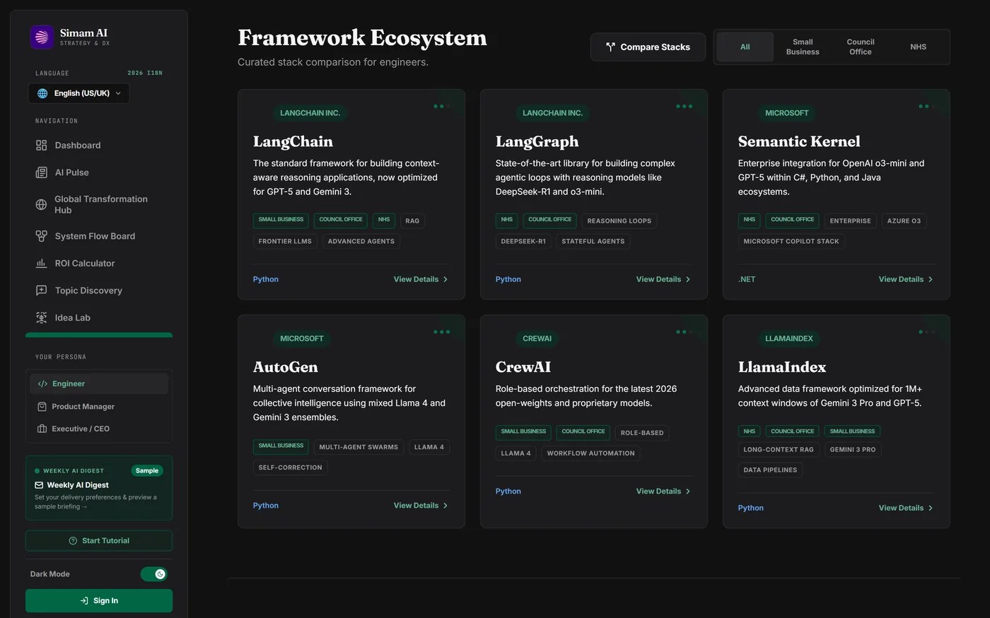
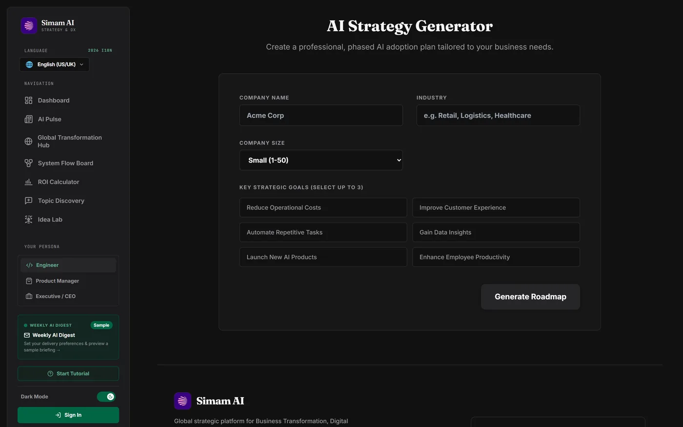
The interesting work was rarely the feature. It was the second-order problem the feature exposed — and in more than one of these the obvious fix was tried first and turned out to be a regression.
Symptom. The news surface promoted a personal newsletter alongside Google Research, and dozens of stories carried the byline “Hacker News”.
What was actually wrong. Hacker News is a discovery channel, not a publication. Every story arriving through it lost its real provenance. Rather than assume the scale of it, we sampled 100 links and found 72 distinct domains behind them.
Fix. A domain-based re-attribution layer against a map of 34 known publishers. Every source now carries a kind — primary, press or community — and that axis governs ranking and placement, not just a badge. Personal blogs were kept but barred from the lead slot: the objection was to promotion, not to inclusion.
Evidence. Zero aggregator bylines remain. Current mix: 39 primary, 15 press, 6 community.
Symptom. The hero carousel rendered an empty column on some slides.
What was actually wrong. Most lab announcements ship without a preview image. In one run, none of Google AI, OpenAI or Anthropic had a usable thumbnail. The obvious fix — prefer illustrated stories — was tried, and it was a regression: it dropped OpenAI and Anthropic out of the rotation on precisely the days they shipped something. It won a picture by losing the point of the section.
Fix. Image preference now applies within a source, never between them. When a lab publishes without a picture the frame becomes a masthead, the organisation’s name set large. On a story from a frontier lab, whose desk it came from is the strongest thing the slot has to say, so it gets said at full size.
Evidence. The rotation control is a ledger of source names rather than a row of dots — dots report how many slides exist, which is the least interesting fact available.
Symptom. The news refresh workflow was cancelled at the 20-minute ceiling, despite logging completion.
What was actually wrong. The work finished in 19 seconds; the process then refused to exit. Rather than guess, we measured the active handles and found two independent holders of the event loop: the database channel, and five keep-alive sockets left over from feed fetching. An earlier diagnostic run had produced a misleading reading, so it was discarded and the test rerun properly before any fix was written.
Fix. An explicit shutdown that terminates the client and deletes the app, plus an unreferenced fallback timer that only fires if something else is still holding the loop.
Evidence. 1,233s cancelled → 49s, 50s and 53s success across three consecutive runs.
Symptom. The UI read as templated, and nobody could say precisely why.
What was actually wrong. The canvas and the cards were the same colour. With no tonal step between the page and the things sitting on it, every panel had to be separated by shadow and glow. Two duplicate colour families were also in play, running alongside the brand neutrals and the brand green.
Fix. A real canvas-to-card step, the duplicate families deleted, and structure carried by hairlines instead of shadows. Theme tokens are exposed as CSS variables, so one block governs both themes. Charts were the awkward case, because chart colours are values rather than classes; a theme hook watching the root element solved it.
Evidence. An honest finding is recorded in the code: no single green clears the 4.5:1 contrast threshold on both the light and the dark ground, so the two themes take different tints deliberately.
Symptom. Generative features began returning 404s.
What was actually wrong. A preview model had been retired. It was named at six call sites plus the digest default.
Fix. Two named constants — a reasoning model and a fast model — behind a wrapper that detects unavailability and falls back automatically. All eight call sites now route through it.
Evidence. It paid for itself immediately: the key in use turned out to be free-tier, so every request to the larger model returns a quota error. Instead of six broken features, the platform runs on the fast model — and that was surfaced to the operator as a finding rather than hidden by the fallback.
Every figure below was measured against the running application or live infrastructure. None of it is estimated from source code.
29 sources aggregated. 60 stories per refresh from 25 distinct publishers on the visible grid. Source mix 39 primary, 15 press, 6 community. Zero aggregator bylines. The lead rotation covers five institutions and never an individual.
Pipeline run time 49s, down from 1,233s cancelled at the ceiling. Production build 9.5s. Initial JS 1,331 kB down to 336 kB gzipped, with heavy dependencies lazy-loaded per route. 77 kB of compiled CSS. One cached document read per visitor, replacing 29 feed requests.
No horizontal scroll at 375px, with the longest German compound fitting its column. Arabic renders right-to-left without overflow. The carousel is a full ARIA tablist with arrow keys, Home and End, roving tabindex and a visible focus ring. Reduced motion disables autoplay entirely. Typecheck clean.
Four readers, four different jobs the same platform has to do.
Readiness locates the weakest capability, the ROI model turns it into a payback period on localised salary data, and the roadmap sequences delivery with owners and risks. That output is a board paper, not a chat transcript.
App Architect and the System Flow Board turn a strategy discussion into a component diagram and an architecture blueprint that exports to PDF — the artefact that usually costs two weeks of discovery.
AI Pulse exists for the reader making a spending decision. That is exactly why the lead slot is reserved for organisations announcing their own work, and why a weekend blog post is never given a lab release’s authority.
Zero marginal inference cost, a content pipeline running on free CI minutes, and hosting that carries no credential worth stealing. The economics are the argument.
A case study that reports only its wins is a brochure. Three things are genuinely open, and you should hear them from us rather than find them later.
The platform was built and deployed between 16 and 18 August 2026 and has not yet been in front of users. Every number on this page is an engineering or product-quality measurement. Nothing here evidences usage, retention or conversion, and it would be dishonest to imply otherwise.
The subscriber collection has a known hardening gap, documented internally with a specified fix that is scheduled and not yet built. Read and list access are already denied outright, so no address can be enumerated. We record it here rather than quietly leaving it out.
The sitemap advertises ten localised URLs, but the application reads its language from local storage and ignores the query string, so every localised URL currently serves the English interface. The ten translations themselves are complete; the routing is not.
This platform can discuss agent architectures and local inference from experience rather than from a vendor datasheet, because that research runs next door. Simam AI Lab works on applied spatial intelligence, organised around the Simam Intelligence Framework: four layers from spatial capture through models and human approval to deployment on cloud, edge or on-premise. The platform’s green was adopted from the Lab, so the two properties read as one house rather than two unrelated products.
A concise record of what the project set out to prove, the evidence available today, and the next responsible investment step.
Three days was possible because the decisions were made in the right order, not because the work was small. We can do the same in a sector you know better than we do — starting with the toolset, the data boundary and the economics, before a line of product code.