Closure-aware, computed server-side
Shortest path over a GIS path graph in BigQuery, with closed edges joined out of the graph before the search runs rather than filtered from the result afterwards.
A wayfinding and situational-awareness application for a construction site measured in square kilometres — where the roads change weekly, the hazards move daily, and a wrong turn into a haul-truck corridor is a safety incident rather than an inconvenience. Satellite, land-use and masterplan overlays, a 3.5-million-triangle model of the completed site, live GPS, and routing over an authoritative GIS path graph that reroutes around closures declared twenty minutes ago. Delivered as a phased proof of concept, and now in daily use by site staff and programme leadership.
The map is authored by the engineering team rather than surveyed from the world, and rerouting has to respect a road that closed while you were walking towards it.
Shortest path over a GIS path graph in BigQuery, with closed edges joined out of the graph before the search runs rather than filtered from the result afterwards.
A 9 GB orthophoto and multi-hundred-megapixel georeferenced CAD sheets, rasterised into XYZ tile pyramids so the browser only ever fetches the tiles in view.
The completed-site model rendered live on the map through three.js, Draco-compressed from a 219 MB export.
Scores where the next hazard is likely to appear from the site’s own history. Shown on the map. Never allowed to reroute anyone.
The whole application sits behind enterprise auth on one origin, so the routing service is same-origin on the session and the browser never sees a second sign-in.
Around 17,000 lines of typed frontend across 25 data hooks and 22 independent map layers, each able to fail without taking the map down with it.
The engagement was scoped against a numbered contract list: render 2D map tiles, interact with a GIS service to determine routing, represent the user accurately on site from GPS, pan by dragging, accept two locations, display the optimal route between them, run on modern browsers, and be written in TypeScript. Everything built served those eight points first; anything beyond them was marked as a stretch and tracked separately.
The plan mapped each acceptance criterion to a specific day, with a traceability table, so progress was reviewable against the contract rather than against a feeling.
Routing decisions come from a server-side GIS path graph rather than from client guesswork, which is what makes the result defensible to the people who own the site data.
Parts of a construction site have no roads and no public network at all. A client-side snap engine was retained for those, and for offline use.
A site map is only useful if it models the things site teams argue about: where work is happening, what is closed, what is dangerous, and how to get past it.
Modelled as strict types rather than loose JSON: points of interest, sector polygons with status, traversable paths, and the equipment and people moving between them. Category filters let a user reduce the map to what they came for.
Live GPS with heading and accuracy, a recenter control, and graceful handling of denied permission or no signal — the states that actually occur on a site with steel everywhere.
Closures are live state, not a static layer. A route requested while a path is closed comes back around it rather than through it.
Hazard zones sit alongside a separate predicted-hazard layer driven by a cloud model, kept visually distinct from confirmed hazards so nobody mistakes a prediction for a fact.
Wind and air quality read alongside the map, because on an open site in heat they change what work is safe today.
Site staff can place and edit points and zones directly, with editing rights separated from viewing rights.
Different people on a construction programme are asking different questions of the same coordinates. A delivery driver wants the road. A planner wants the land use. An engineer wants the drawing. A stakeholder wants to know what it will look like finished. Each is a switchable overlay over one map, rather than four separate tools.
The programme’s own high-resolution orthophoto of the site as it stands, not a consumer basemap that was last flown before the ground was broken. This is the layer that makes the map recognisable to somebody standing on it.
What each parcel is designated for across the masterplan, so sector boundaries and work areas read against intent rather than against a colour nobody can decode.
The engineering masterplan sheets themselves, georeferenced and laid over the imagery, so the drawing and the ground line up in one view instead of on a laptop next to a window.
The full architectural model of what the programme is building, rendered live on the map. Useful to leadership for the obvious reason, and useful on site for a less obvious one: it shows what is about to be where you are standing.
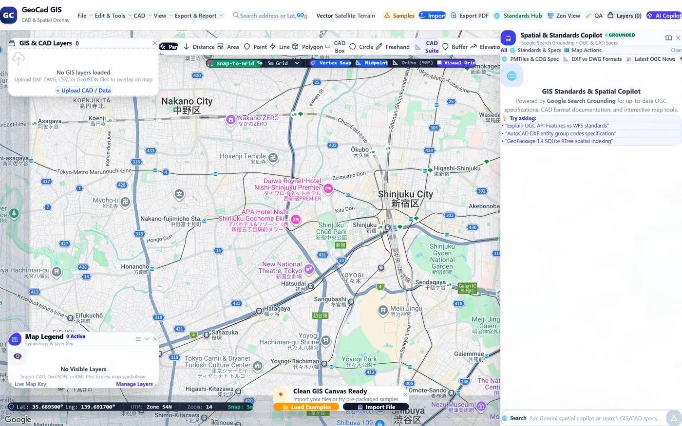
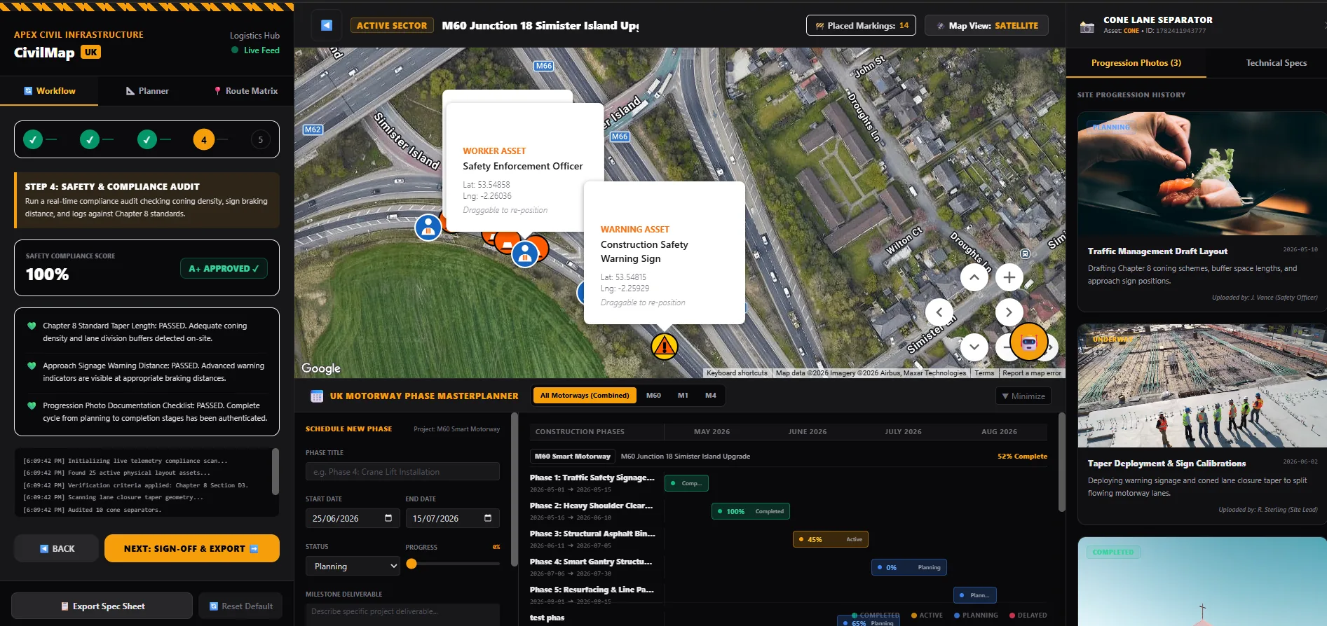
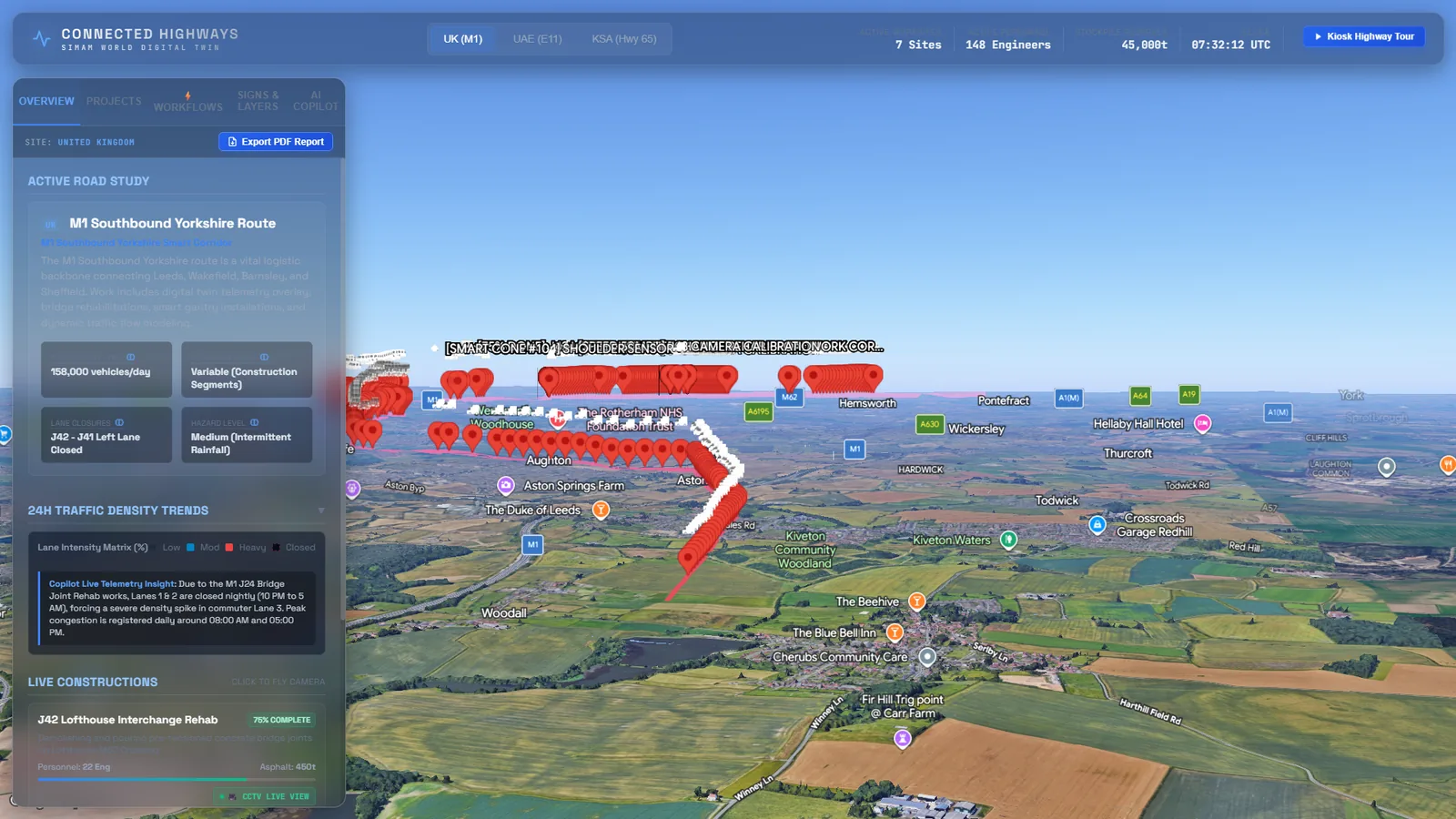
The programme’s geospatial data is enormous and none of it is web data. The orthophoto is 9 GB. The masterplan sheets are two-hundred-megapixel georeferenced rasters. The users are outdoors on a construction site, which is the worst network in the world and exactly the condition the application exists to serve.
A rasterisation and georeferencing pipeline turns the CAD deliverables into XYZ tile pyramids — the same scheme the major map providers use. One sheet went from a 19.7 MB georeferenced BigTIFF to a 1,888-tile, 28 MB pyramid spanning zoom 0 to 19.
Reprojecting from the site’s UTM zone into Web Mercator has to happen tile by tile. The site sits far enough from its central meridian that grid north and true north differ by about 0.7°, so a single affine transform across a whole sheet visibly skews it. Done per tile, the rotation disappears.
A pyramid only renders as deep as its source. Satellite imagery of the site goes to zoom 20; the masterplan sheet renders to 19. Past that the standard overlay simply stops drawing — and users do not read that as “out of resolution”, they read it as “the plan switched itself off”. A hand-rolled map type now draws the deepest tile that covers the requested slot, magnified by the right power of two and clipped to the correct quadrant. No sharper than the source, but continuous.
Below a pyramid’s lowest level a single tile would have to composite a thousand tiles beneath it, so the pyramid has to ship overview levels. Building them correctly meant discovering the source tiles store transparency premultiplied: box-averaging the RGBA naively drags every anti-aliased edge toward black. Halve repeatedly, un-premultiply, and the whole zoom-0-to-12 tail costs 13 tiles and 24 KB — smaller than one full-detail tile.
Why the tile-selection maths is unit tested. Getting a quadrant wrong is the kind of bug you cannot see until somebody is standing on site looking at the wrong building. The selection logic was written as pure functions specifically so it could be tested away from the map.
The completed-site model arrived as a 219 MB export carrying 3.9 million triangles in raw absolute coordinates. Getting it onto a map on a phone took solving four separate problems, none of which was rendering.
Draco mesh compression took it to 19 MB and cut peak browser heap from 1,268 MB to 324 MB. The compression was verified by triangle count rather than by eye — which is what caught a different colour export in the same delivery that had silently lost 69% of its geometry in conversion. It looked fine until you counted.
The geometry carries absolute eastings and northings, which places its origin hundreds of kilometres from the site. The renderer re-centres on the model’s own bounding box, so its anchor means “where the centre of the footprint sits” whether the file arrives world-absolute or local.
The naive approach seats a model on its lowest point. This file contains a stray 900 × 557 m solid sitting 82 m below everything else, so that approach planted that on the ground and left the entire visible masterplan hanging 87 m in the air. Ground is now defined as the lowest elevation with meaningful area at it — weight each mesh by its footprint, walk up until 5% of total area is behind you — which lands on the site plate rather than the deepest basement.
The Draco decoder is vendored rather than pulled from a public CDN. The application runs behind enterprise auth on a construction site with bad signal, and a third-party runtime dependency in that position is a liability. The model renders through three.js into the vector map’s own WebGL context, camera-synced every frame, with explicit GPU disposal on teardown — otherwise several hundred megabytes of VRAM stay held every time somebody flicks off the 3D tab.
The client holds no privileged credentials. A small TypeScript proxy fronts the mapping and routing calls and any model endpoints, and ships as a single container. Map keys that must be client-side are referrer-restricted.
The deployed application sits behind an identity-aware proxy, so the routing service can be reached same-origin on the session — no second sign-in, and no cross-origin surface to secure separately.
The map is a declarative component with overlay layers driven from application state, so points, sectors, routes and closures stay consistent with each other instead of drifting as imperative layers do.
Service responses pass through an explicit parse-and-map layer before reaching component state, which keeps a change in the routing service from silently reshaping the UI.
What this proves: a site operations map can be built to a contract acceptance list, deployed behind real access control, and still stay honest about the difference between a confirmed hazard and a predicted one.
A hazard layer is easy. Deciding which hazards are permitted to redirect vehicles across an active construction site is the design work, and it is a safety question before it is a software one.
A supervisor declaring a geofence is authoritative. The closed edge is joined out of the routing graph before the next search runs, so the closed road never enters the search space at all — rerouting is not a post-processing step over a route that already went through it.
A worker reporting a spill does not move traffic on their own. The report self-expires, and only begins affecting routes once other people on site have confirmed it. Waze-style input, without letting one mistaken tap redirect every vehicle on the programme.
Gemini on Vertex AI scores where new hazards are likely to appear, from where zones have been declared before, how long they stayed active, and which crowd reports were confirmed. Predictions above a tunable threshold surface as a distinct visual class. They never reroute anyone.
The boundary is enforced in the routing SQL, not in a comment. Letting a language model silently redirect vehicle traffic around a construction site is not a product feature, it is a liability. An AI-predicted hazard is advisory — it tells a supervisor where to go and look.
Tested on a Samsung S24 and a Tab S6, on site, with the native map application open alongside as the quality bar. Almost none of what that day produced would have been found at a desk.
The cone showing which way you are facing was driven by GPS heading — which is direction of travel, and is null when you stop. So it pointed the wrong way at exactly the moment somebody stopped to get their bearings. It was never a rendering bug. It was the wrong sensor, and it now reads the magnetometer.
The bottom sheet was rebuilt around pointer velocity, so a flick snaps in the direction it was flicked, and around a gesture that decides between dragging the sheet and scrolling its contents on the first meaningful movement. That decision is what stops it feeling twitchy in one hand.
The document is locked against overscroll so a drag on the map cannot bounce the page or trigger a reload mid-route, and every edge-anchored control respects the notch and the home indicator.
Reported by a stakeholder using the application on site. The obvious conclusion was that our georeferencing was wrong, and the obvious conclusion is where a lot of engineering time goes to die.
And still showed the same white rectangle at identical bounds — so the artefact came from the orthophoto layer beneath, not the plan. Sampling our own tiles confirmed it: the corner tile was 98.5% transparent, and only 6 of 400 sampled tiles were more than half opaque. The plan looked displaced because the layer underneath it had moved, and the plan is the thing you switch to, so the plan got the blame.
The fix was one line. Finding it was the work — and the report was right that something was wrong, even though it was wrong about which layer. That feedback loop, with senior stakeholders using features on site and returning specific reproducible reports, is what a proof of concept in real hands buys you.
Both of these builds answered the same question from different directions: authoritative geospatial routing for operational use, and photoreal capture for comprehension and stakeholder communication. They are complementary, not competing.